Art of Science
This is a selection of my favorite visualizations made from real data occassionally with some artistic flair.
Examples from Neutron Diffraction data
The following gallery entries (“Neutron Squid” and “Eye of Neutron”) are derived from neutron diffraction data. The data is typically viewed by scientists by looking at $I(q)$ plots that have the following flavor:
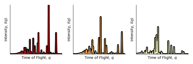
The plot is essentially a histogram; the x-axis marks the bins, and the y-axis the height of the bins. As a part of the ExaLearn project team (a project under DOE-ECP, Department of Energy Exascale Computing Project) we generated many expected diffraction patterns using a software package called GSAS-ii. The different patterns come from different possible crystal symmetry groups of Barium Titanate (with differing lattice parameters). The two following images are differing representations of many of those diffraction patterns.
“Neutron Squid” (2019)
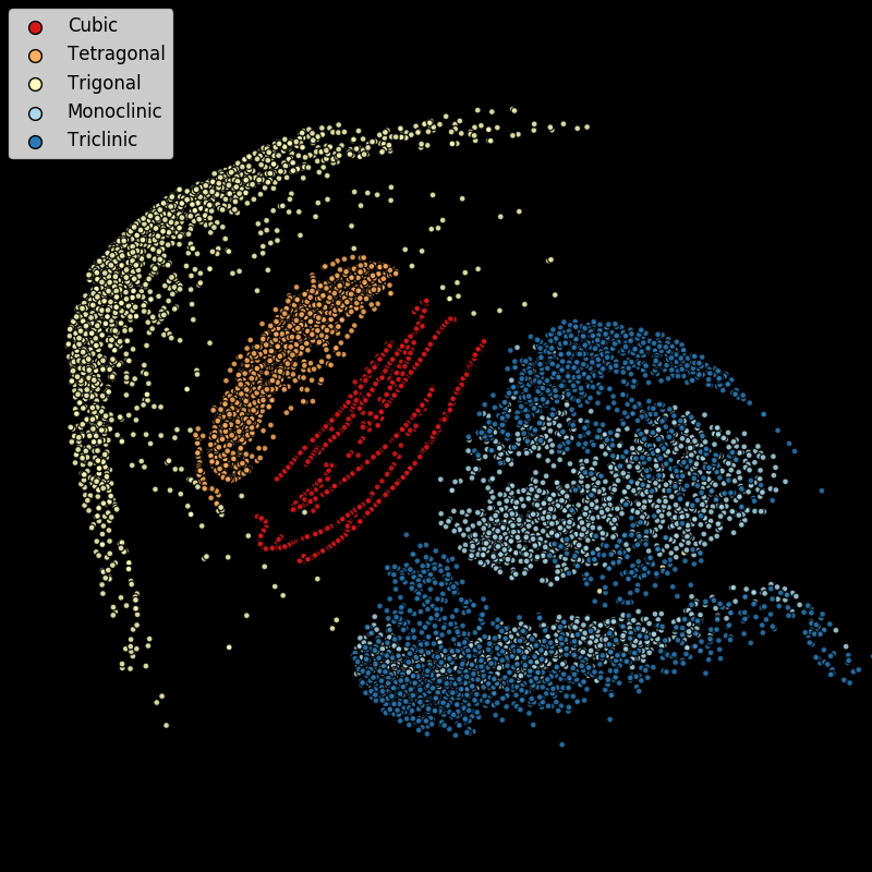
In this image used multidimensional scaling (MDS) applied to 10,000 randomly chosen $I(q)$ vectors. MDS finds a lower-dimensional (in this case 2-dimensional) representation of the data that preserves pairwise distances as much as possible. One of the questions we were exploring is whether or not the crystallographic symmetry group can be determined solely from the $I(q)$ plot. In this figure, symmetry groups share a color and the indication is that, with the exception of the monoclinic and triclinic examples, simple distance based techniques (such as $k$-nearest neighbors) will pretty often correctly predict the symmetry group.
“Eye of Neutron” (2019)
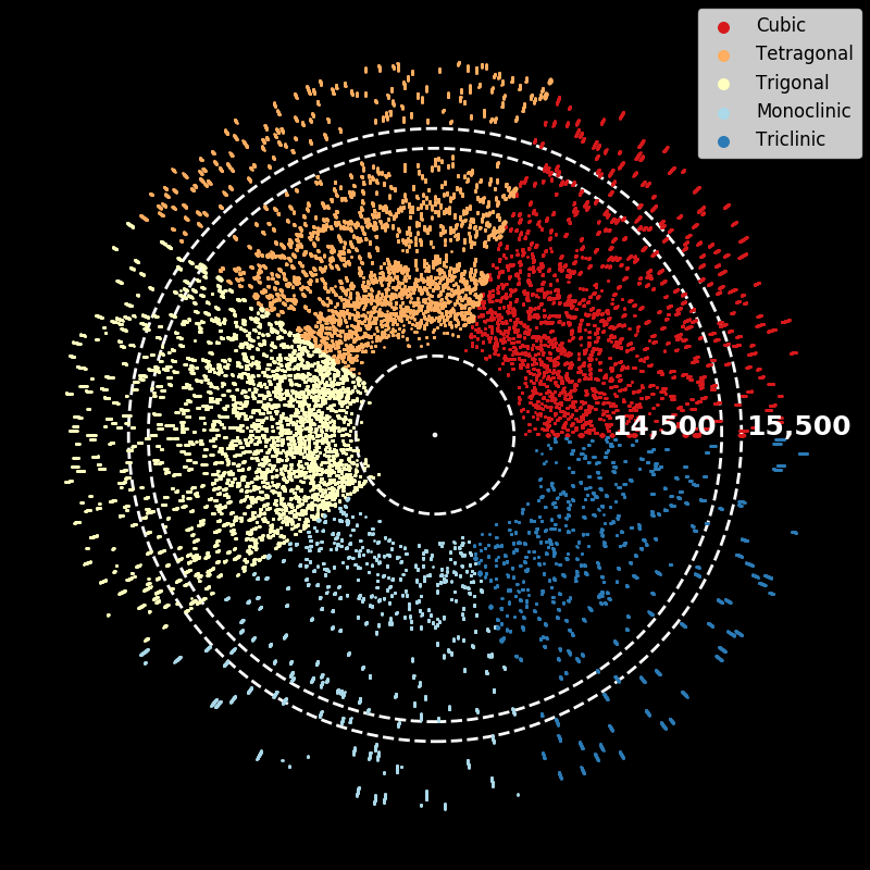
To create this figure we reduce each $I(q)$ plot (in this case just 500 of them) to a binary sequence: peak or not-peak. The reason being that location of peaks conveys a lot of information about the physical properties of the material. We place each binarized $I(q)$ plot on a ray from the origin (a point where a peak is present) and plot them all together. There’s at least two things visible in the figure. First, there are no peaks in the “Tetragonal” class for $q\in [14500, 15500]$ (a distinguishing characteristic for that class). Second, the monoclinic class (light blue) has the fewest number of peaks since the number of points in that region is lowest. Note, that putting the lines on rays from the origin to make a circle/disk/eye was a bit of possibly unnecessary artistic flair… but it made the figure more fun than, say, orienting all the binarized $I(q)$ plots vertically and stacking them side-by-side.